

The community magazine for the community
Powered by 
The community magazine for the community
Powered by
© Design Courier. Powered by Medelhan. Developed by Broadweb.80
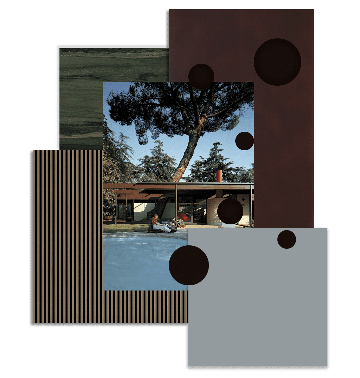
| CANVAS OF PLANS & DRAWINGS |
INTERIOR & DÉCOR, but with a twist |
| HOTELS & RESTAURANTS, beyond mainstream |
Notes on ART |
| Into big AFFAIRS | INSIDERS |
| GLIMPSES | |
Keywords:


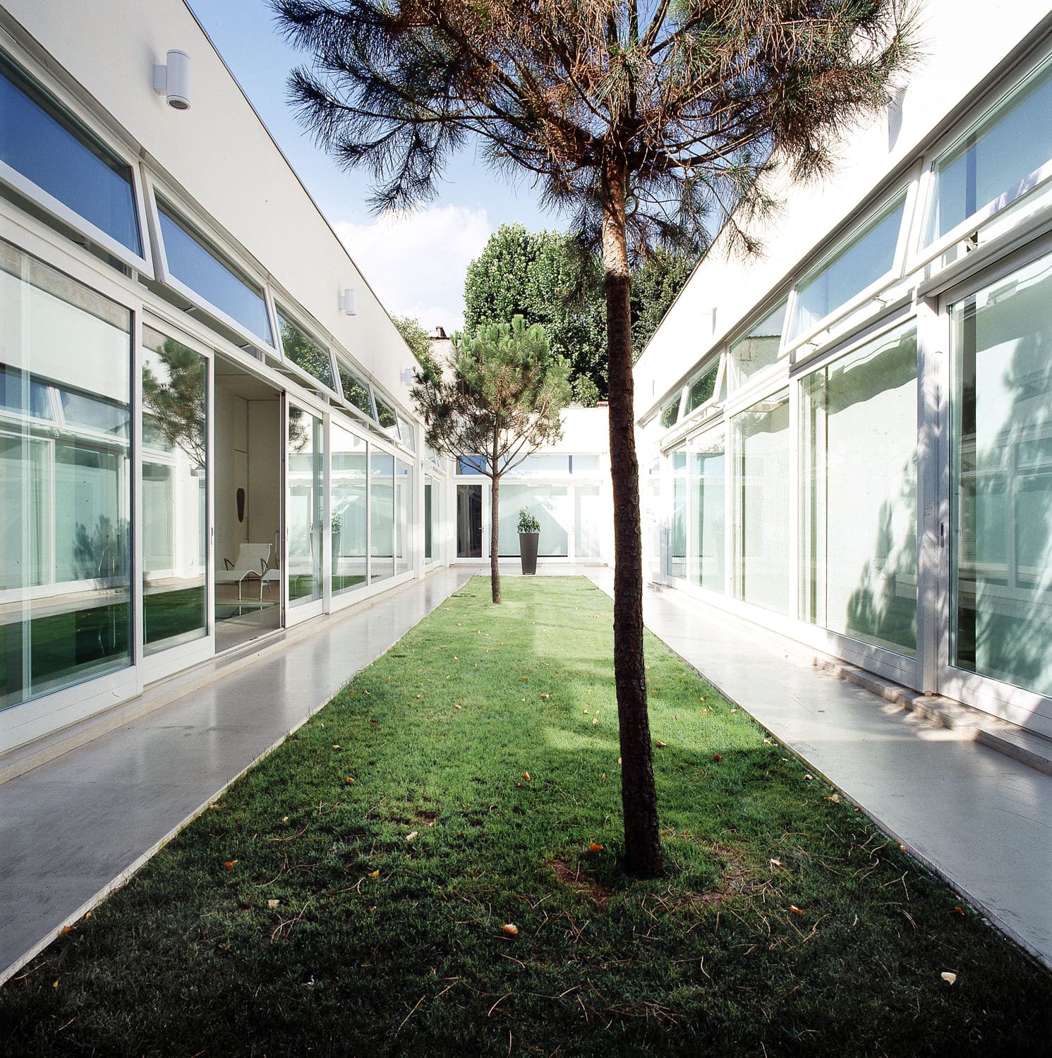
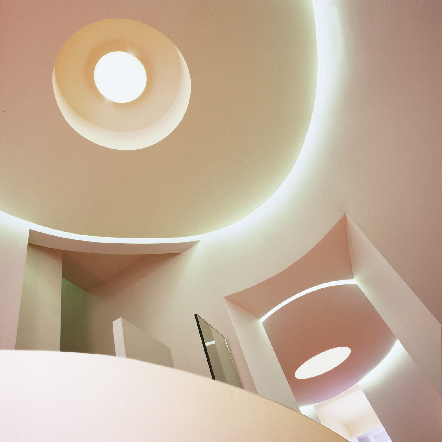
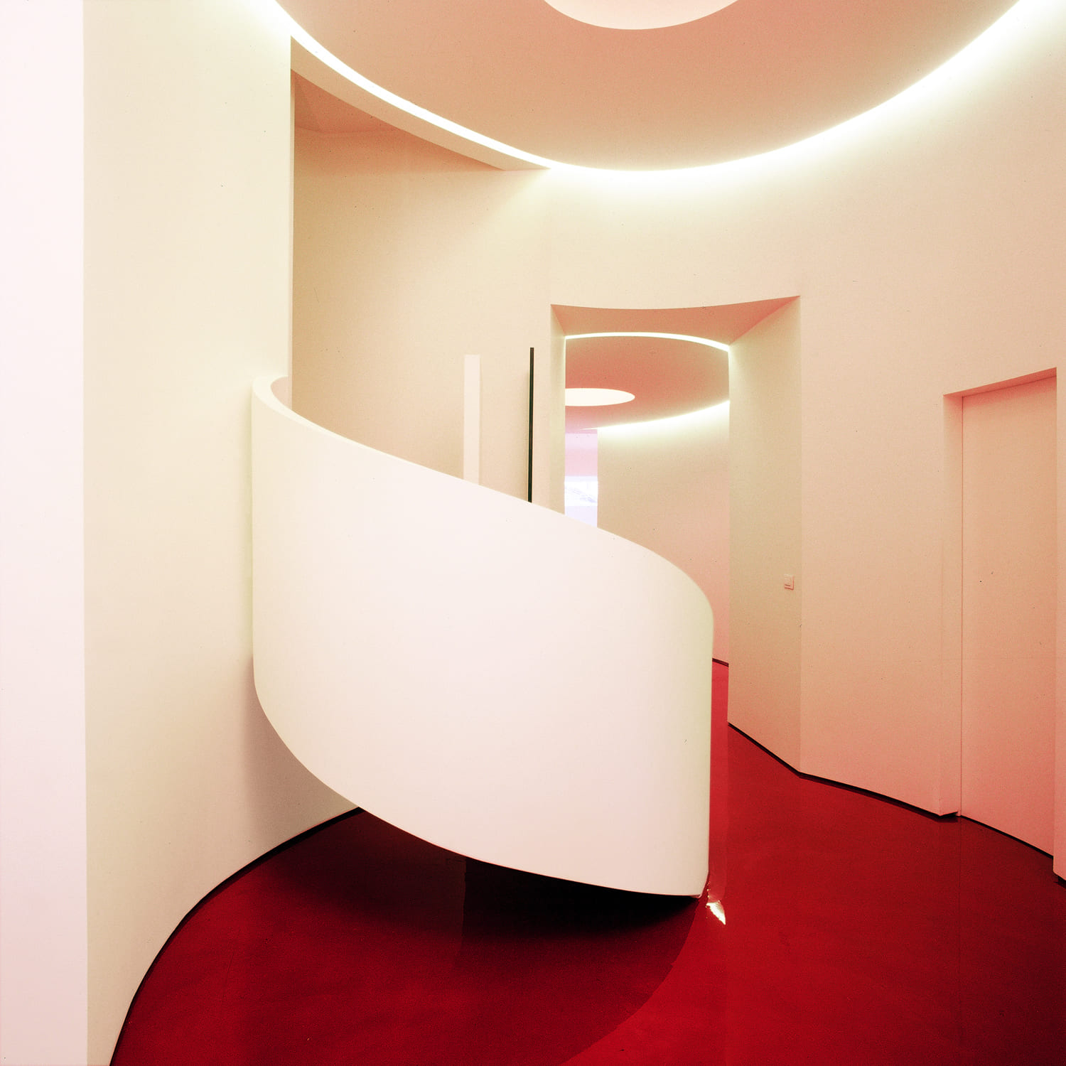
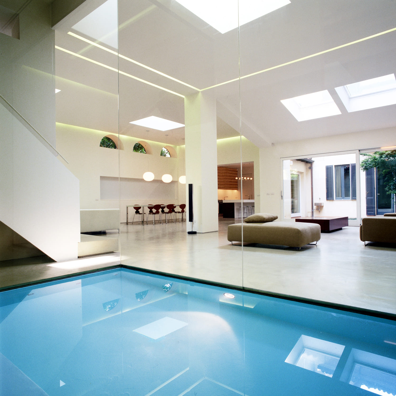
First, we need a premise, Carlo Donati Studio works widely on the multiplication of points of view and on the intersection of spaces, so that the different areas that make up the house may always interface with each other. I believe that the richness of the views and the environments of the house are added values to the design. Speaking of the last twenty years, I think there has been a progressive shift towards a more fluid, open and flexible design approach. In particular, we have seen a progressive revaluation of areas that until twenty years ago were considered secondary, such as the kitchen space and its furniture, which today is usually placed in a more open context and in dialogue with the rest of the house. Even the bathroom area has undergone a great evolution, increasingly becoming a wellness space.
It is also interesting to note the passage from the minimalism of the nineties – when the decorations were almost absent and there was a certain formal cleanliness, with neutral colours and materials – to the return to colour and saturation in the following decade. Therefore, a more overwhelming, natural and lived-in architecture concept. The pandemic has certainly accelerated some processes that were already in place, such as that of osmosis between home and nature. In summary, today’s home is less “designed” and more real.


Since 2005, the year in which Giacomo De Amicis founded deamicisarchitetti, the Italian studio gives rise to projects that combine memories and contemporaneity. Its specific language, which is composed of advanced criteria of environmental sustainability, comfort, technology and attention to the context, applies to the most diverse areas.
